Best Data Visualization products
Data visualization transforms complex data into clear visual formats, enhancing understanding and insights. We can help you explore top tools and resources to elevate your data visualization efforts.
Freemium
STRING
Conversational analytics tool for seamless data interaction.
Freemium
DataSquirrel
Automated data analysis and visualization for non-tech users.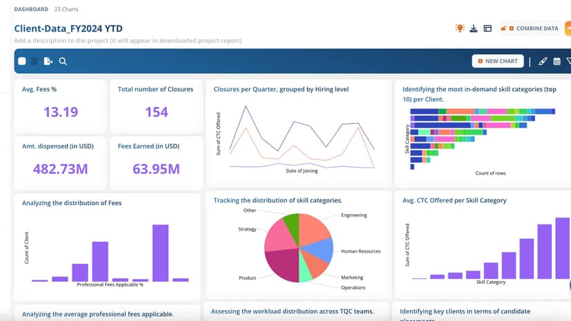
Freemium
Wistanomic
User-friendly array data processing application for data analysis.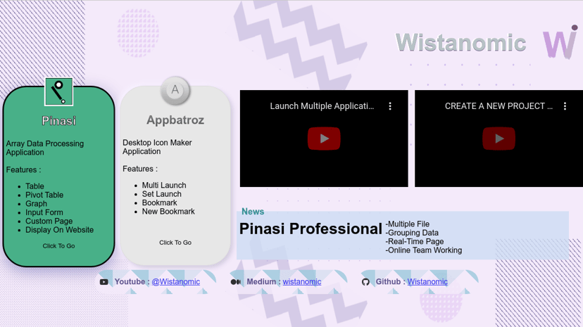
Freemium
Lucidchart
Next-generation diagramming with AI, data, and automation tools.
Custom Pricing
Datarails
AI-powered FP&A solution for budgeting and forecasting in Excel.
Freemium
Netdata
Real-time, high-resolution monitoring for systems, containers, and applications.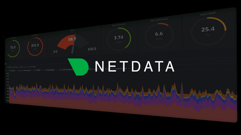
Freemium
Julius AI
AI data analyst for analysis, visualization, and forecasting.
Freemium
Napkin AI
Transform text into visuals for effective communication and ideas.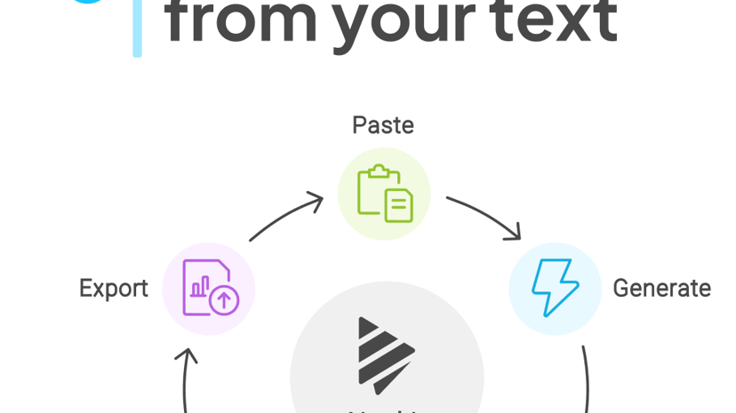
Free
Infografix
AI-powered tool for creating customizable infographics easily.
Freemium
Maptive
Custom mapping software for sales territories and route planning.
Custom Pricing
Maplytics
Geo-mapping solution for visualizing Dynamics 365 CRM data.
Freemium
Visual Data Tools
Fast and affordable analysis and visualization software for researchers.
Freemium
Dashbreeze
User-friendly online dashboard creator with no coding required.
Paid
Tableau
Data visualization software for analytics and insights.Product
Inkdrop
Automatically generate interactive diagrams of cloud resources and dependencies.
Freemium
Groupt
Transforms complex data into actionable insights through categorization.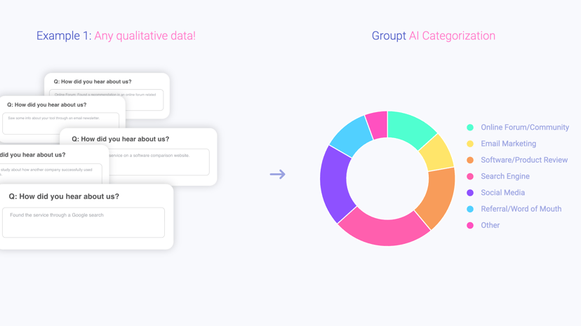
Freemium
Tabula
AI-powered platform for data aggregation, transformation, and visualization.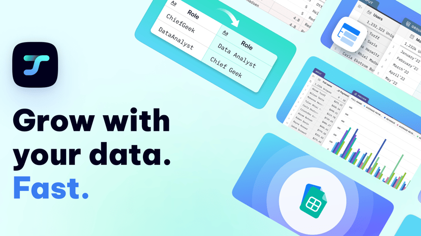
Freemium
InfraNodus
Network analysis tool for text mining and visualization.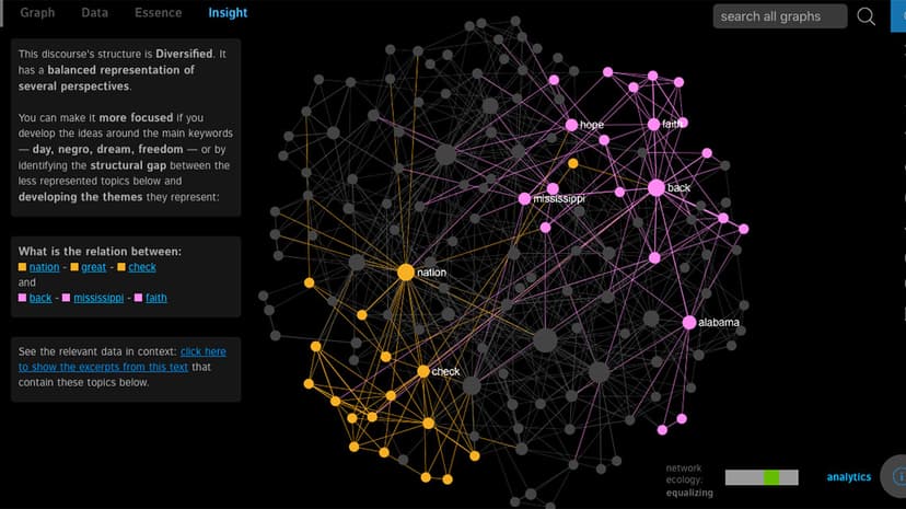
Freemium
Powerdrill
AI service for fast insights from personal and enterprise datasets.
Freemium
Hex
Collaborative, AI-powered data analysis and visualization workspace.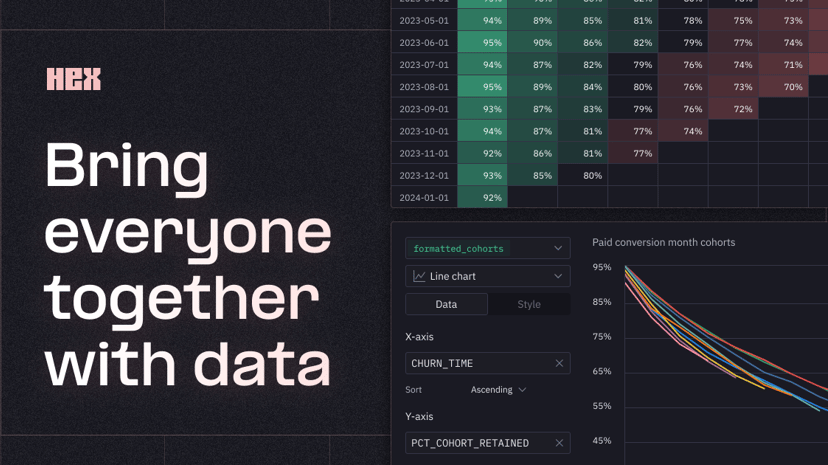
Freemium
Dxyfer
Augmented intelligence platform for instant data insights and visualization.
Freemium
SmartVisuals
AI-based infographic generator for creating and customizing visuals.
Paid
Lychee
Create stunning, customizable charts effortlessly with Easy Charts.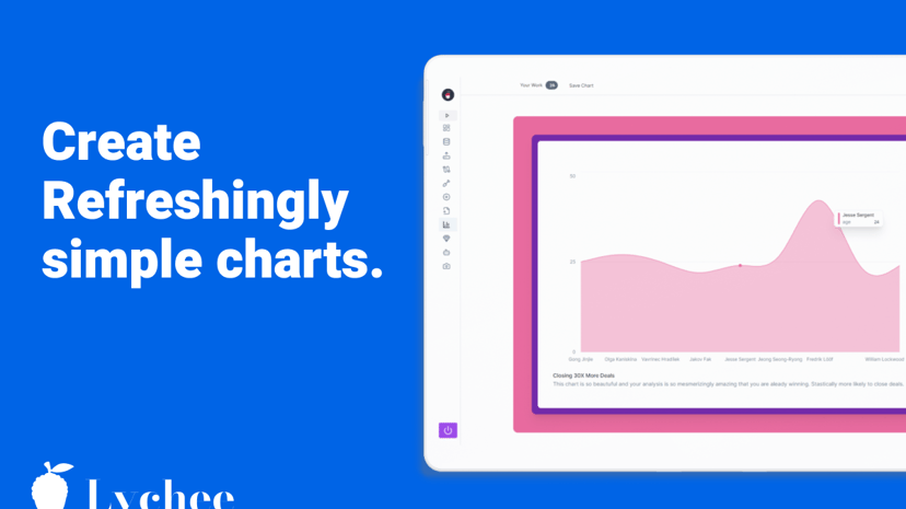
Freemium
Esri
Powerful GIS mapping software for location intelligence and spatial analytics.
Freemium
Baseboard
AI-powered tool for customizable data visualization and insights.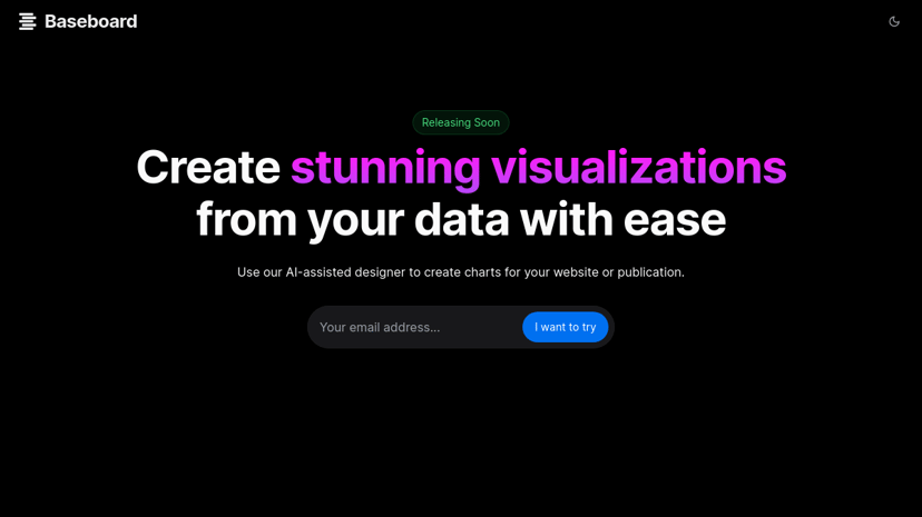
Freemium
Sprucely
Automated data insights and interactive dashboard software solution.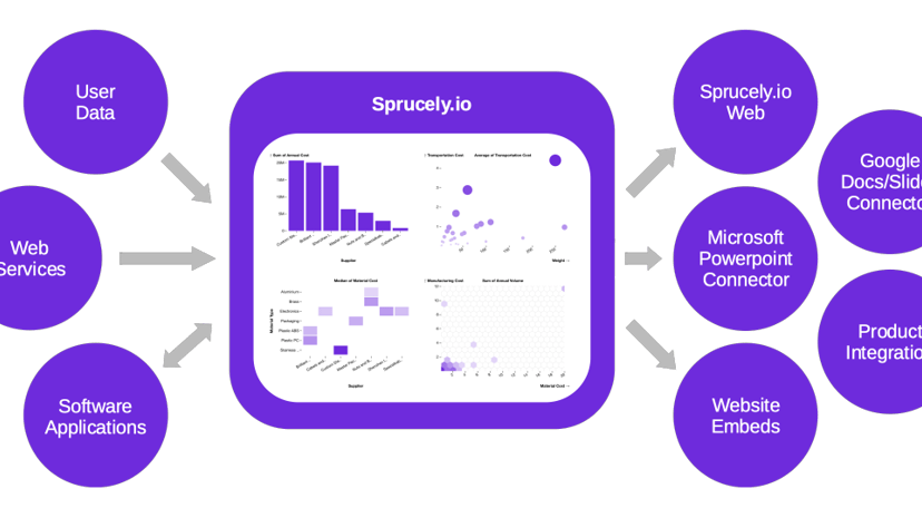
Freemium
Zing Data
GenAI platform for data analysis with natural language querying.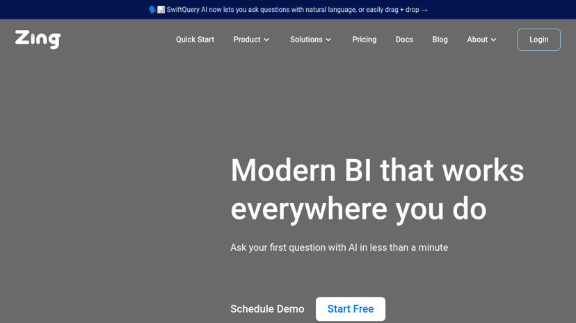
Freemium
Quills AI
AI assistant for intuitive data analysis and SQL query generation.
Product
Gitmotion
Generate visualizations of Git repository history in-browser.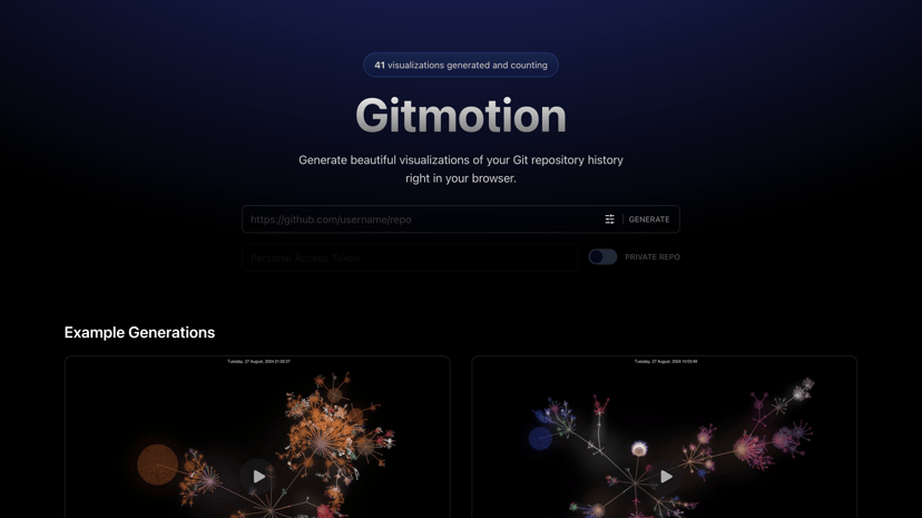
Freemium
Vizly
AI-powered data analysis and visualization tool for insights.
Data Visualization: A Tool for Insight and Clarity
Data visualization is the practice of representing information and data in a graphical format. By using visual elements like charts, graphs, and maps, this method allows individuals and organizations to see patterns, trends, and correlations that might go unnoticed when datasets are presented in text form. As data continues to accumulate at an unprecedented rate, effective data visualization has become increasingly important in various fields, from business to healthcare to education.
Why Use Data Visualization?
One of the primary benefits of data visualization is its ability to facilitate quick understanding of complex data. Humans are naturally inclined to process visual information more efficiently than numerical data. Through visual representation, insights can be gleaned faster and more effectively. This is particularly beneficial for decision-making, as clear visual data can highlight important trends and anomalies.
Moreover, data visualization encourages engagement. Presenting information visually can foster communication and collaboration among teams, making discussions around data-driven decisions more productive. Improved clarity can also enhance storytelling, allowing organizations to convey their message succinctly and compellingly to stakeholders and clients.
Common Features of Data Visualization Tools
When considering data visualization tools, several common features can enhance user experience and outcome:
-
Variety of Visualizations: Effective tools offer different types of charts and graphs, including line charts, bar graphs, scatter plots, and heat maps, enabling tailored representations of data depending on the context.
-
User-Friendly Interface: An intuitive design is crucial for users of all levels. Ease of navigation and accessibility to features can significantly enhance productivity.
-
Integration Capabilities: Good visualization tools can integrate seamlessly with existing data sources—such as databases, spreadsheets, and other analytical tools—allowing for streamlined data analysis.
-
Customization Options: The ability to customize visualizations helps in creating reports and dashboards that align with specific business needs or branding guidelines.
-
Interactivity: Interactive features—such as drill-down capabilities and filtering options—enrich the user experience, allowing stakeholders to explore the data more deeply.
What to Consider When Choosing a Data Visualization Tool
Different tools cater to various needs and preferences, so several factors should be taken into account when choosing a specific product:
-
Target Audience: Understanding who will use the visualizations can help in selecting the right tool. Some tools are designed for technical users, while others cater to a non-technical audience.
-
Scalability: Consider whether the tool can grow with your data needs. Scalability is essential for businesses that anticipate increasing amounts of data over time.
-
Cost: Pricing can vary significantly between products. Assessing the budget while considering both initial and ongoing costs is important.
-
Support and Community: Strong customer support and an active user community can provide vital resources for troubleshooting and best practices.
-
Trial Options: Many software providers offer free trials. Testing a few options can provide insight into which tool fits best before making a commitment.
Finding the Right Data Visualization Tool
Navigating the array of options available can be challenging. However, we can assist in simplifying this process by providing a comprehensive directory of the best data visualization products. This resource includes detailed descriptions of each tool’s features, pricing information, competitor analysis, and alternative options. By utilizing our directory, users can make informed decisions tailored to their specific needs and goals. Whether for personal growth or business strategy, the right data visualization tool can make a significant difference in achieving clarity and insight from complex data.